Skip to content
A–B–Creative
Brand identity / Editorial design / IllustrationBarcelona / Local news

BCN TODAY

A voice of its own.
Every day.

An identity that looks, reacts and turns information into a recognisable visual language.
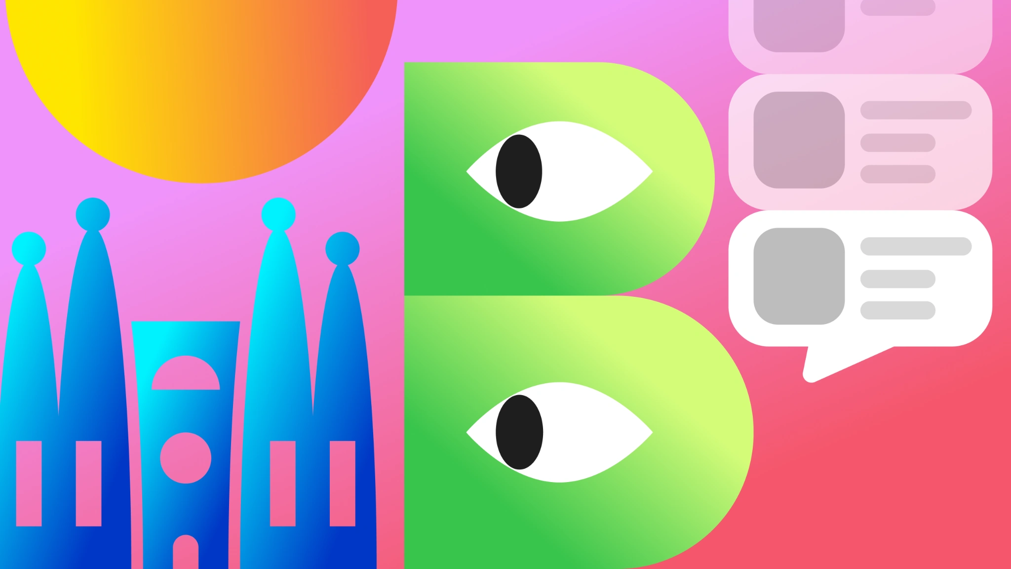
Original BCN Today composition with a green B with eyes, blue Sagrada Família towers, gradients and news bubbles on pink.
BCN Today / A visual system for local newsView the original case ↗
01 / The challengeOne brand among many stories

News with
personality.

Give a local news project a voice of its own, connecting headlines, data and everyday topics through a coherent identity.

The work brings together brand identity, a colour language, illustration and editorial applications.

02 / The ideaThe brand as a character

One letter.
Many ways to tell a story.

A B built from two rounded modules and expressive eyes: a mark that can show curiosity, alertness, humour or tiredness.
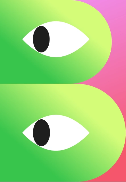
Original BCN Today B mark, built from two rounded forms and expressive eyes.
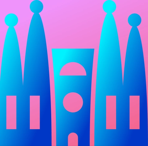
Original geometric illustration of the Sagrada Família towers for BCN Today.
Barcelona, in a few shapes.

Geometric towers and a news bubble place the visual language between the city and the conversation.

An identity
that reacts.

The same mark changes its expression while keeping its structure. Explore four states from the original system.
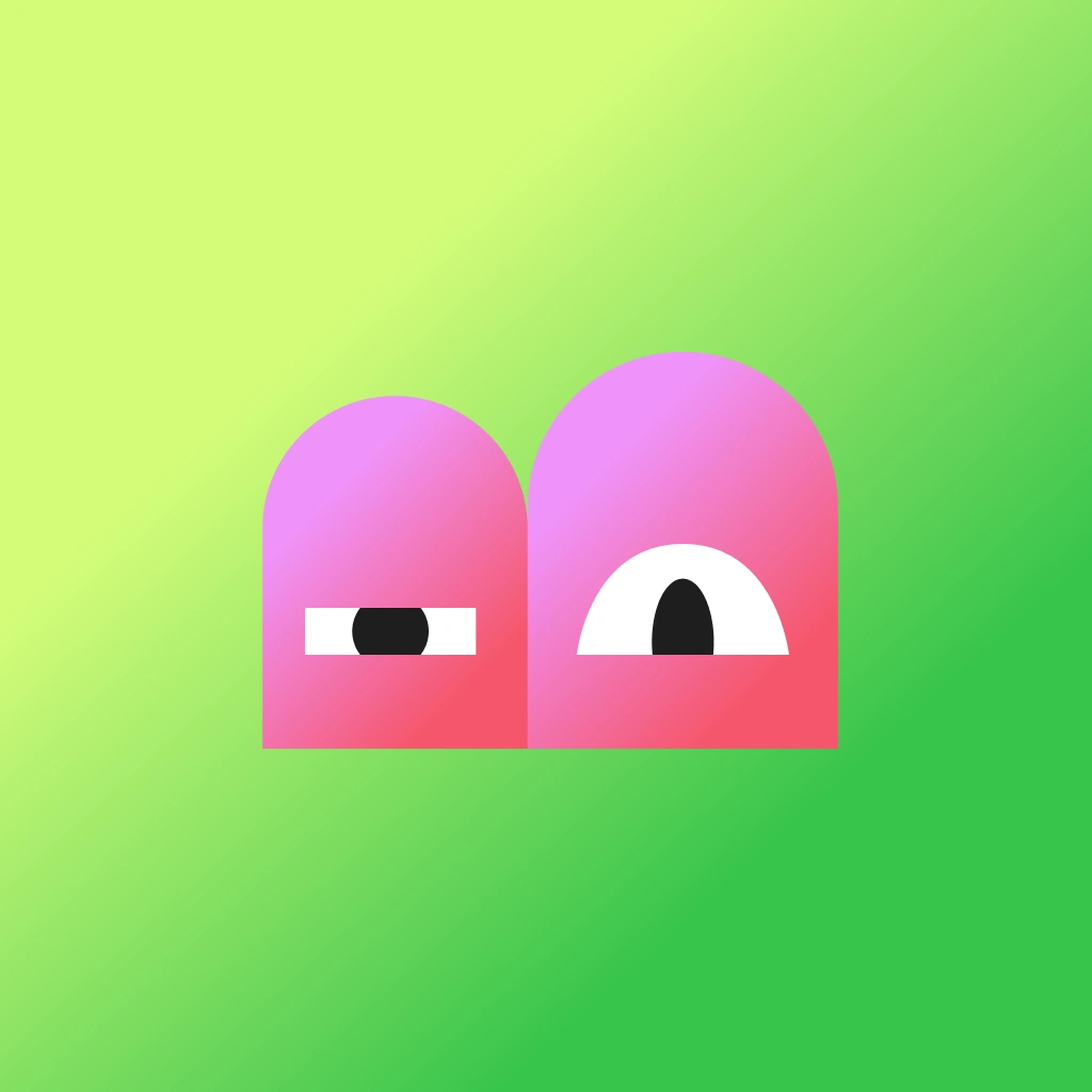
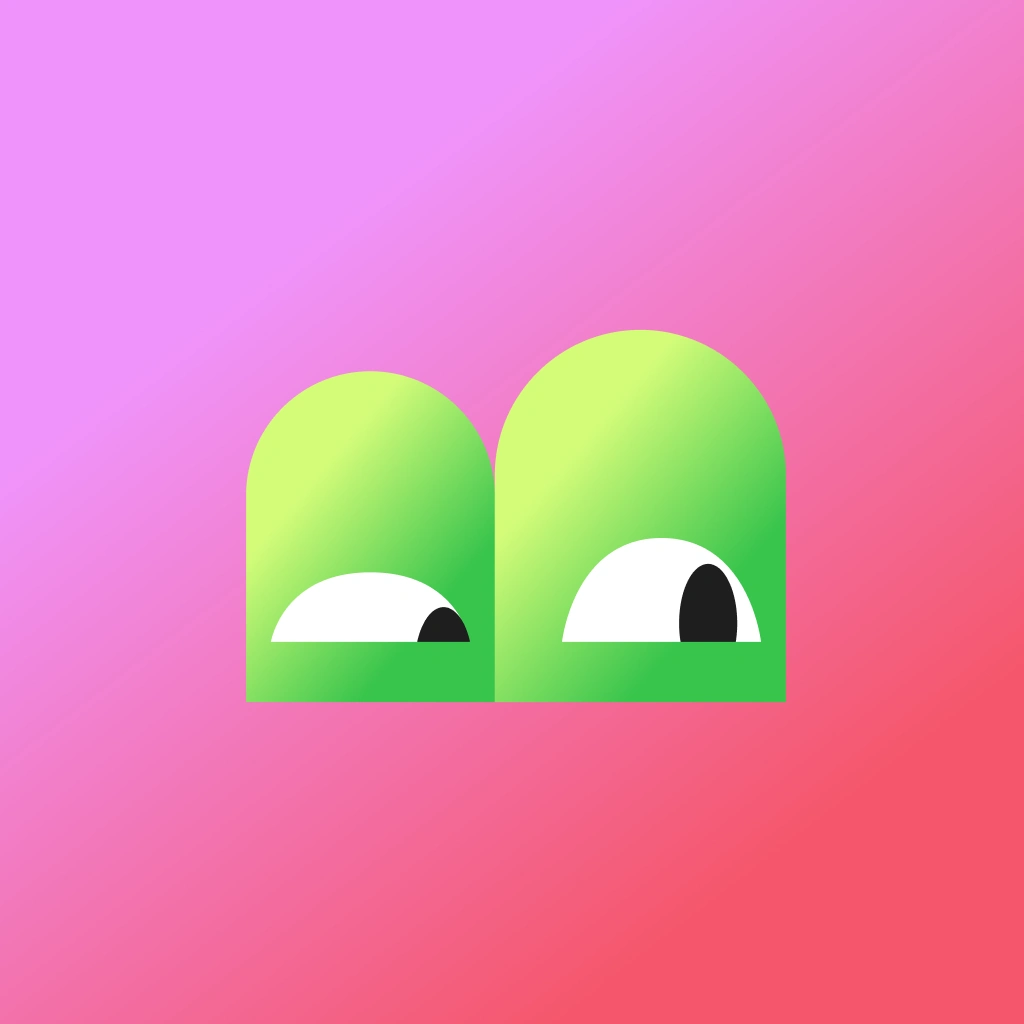
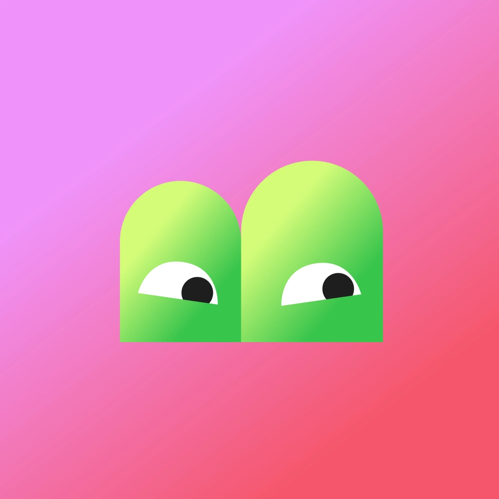
Original BCN Today mark with a curious expression.
Curiosity
Original BCN Today mark with an alert expression.
Alert
Original BCN Today mark with wavy eyes and a humorous expression.
Humour
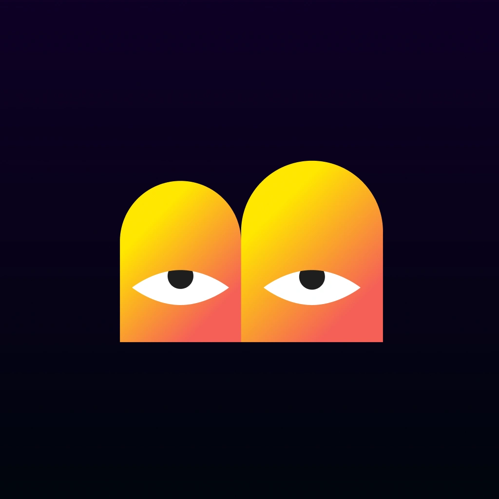
Original orange BCN Today mark with a tired expression on a dark background.
Tiredness
Original BCN Today mark with a curious expression.
Brand expression: Curiosity

Choose an expression. You can also use the keyboard arrow keys.

03 / ColourGradients and contrast

Energy you
can recognise.

Pink, green, orange and blue form four colour families found in the work. Gradients connect simple shapes with a lively expression.

Pink#F093FB → #F5576C
Green#D4FC79 → #39C54C
Warm#FFE600 → #F56057
Blue#00F2FE → #0037C6
04 / The editorial systemA hierarchy for reading

First, the headline.
Then, the story.

Large headlines, direct questions and data organised into blocks. An editorial sequence turns one subject into several pieces that belong to the same recognisable brand.

In the original artwork: Alter Aves Demo for expressive headlines and Open Sans for informational text.
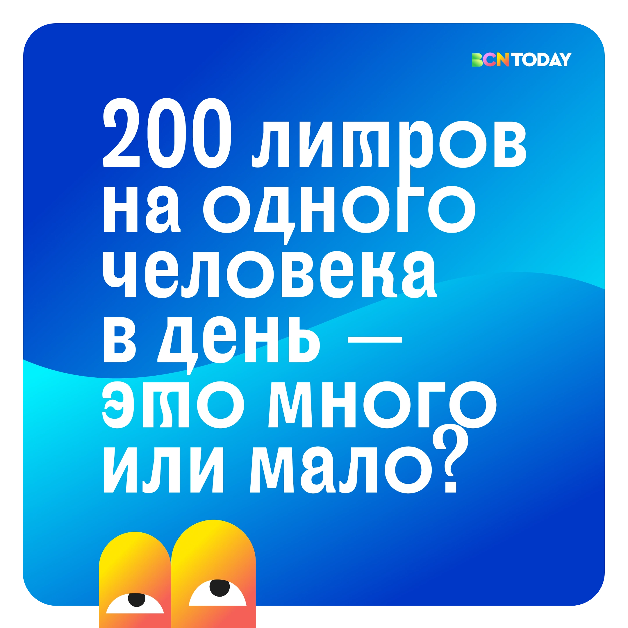
Original Russian-language editorial piece asking a question about water consumption.
01 / The question that opens the topic
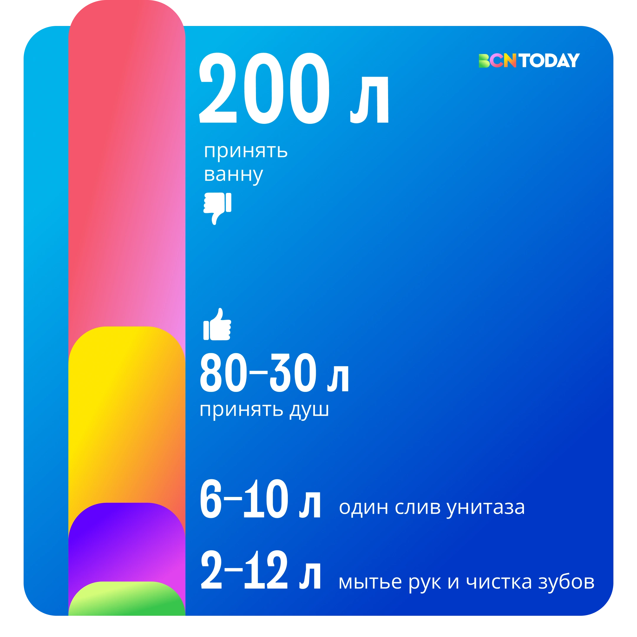
Original Russian-language editorial piece visually comparing quantities of water.
02 / A visual comparison
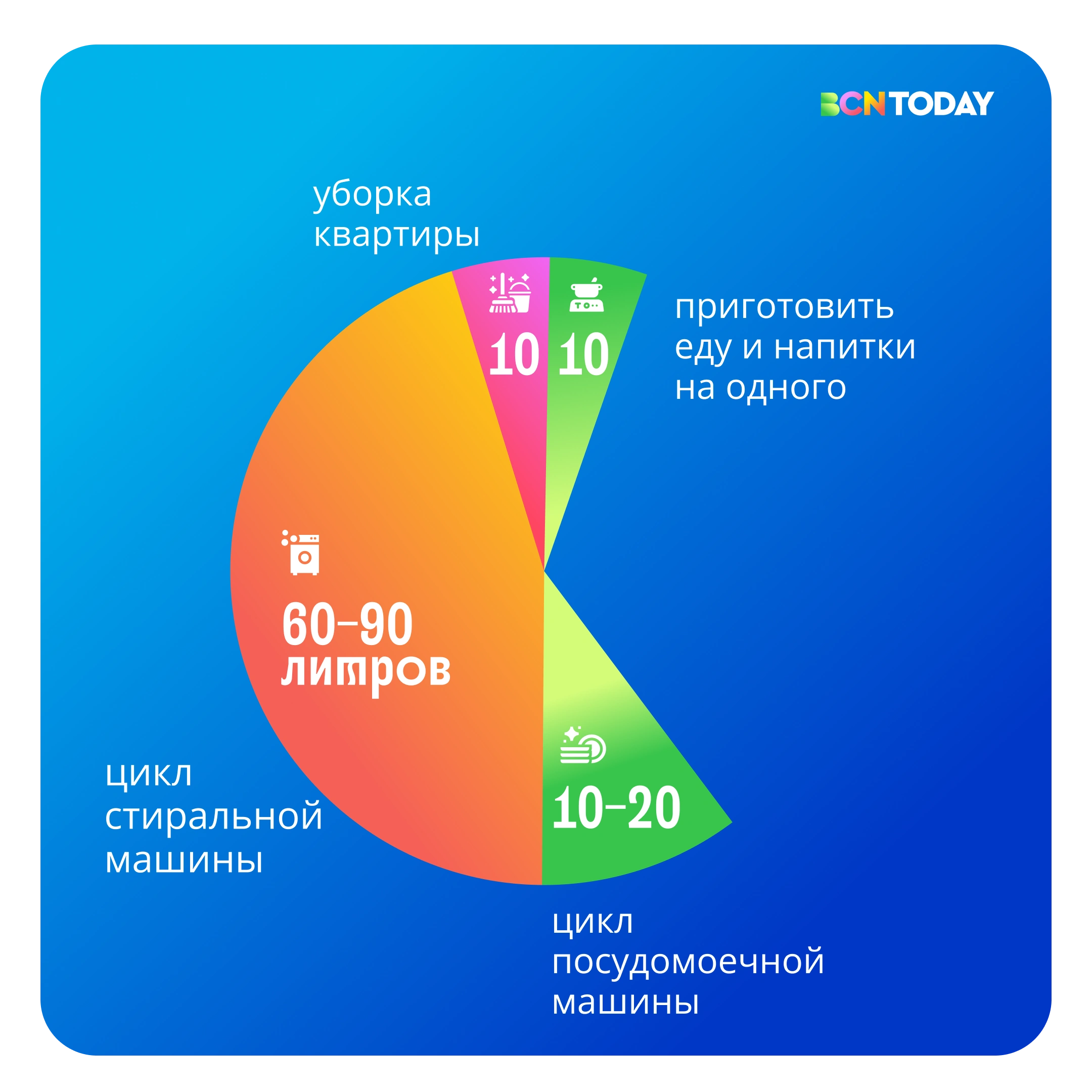
Original Russian-language editorial piece organising different uses of water.
03 / Uses, organised
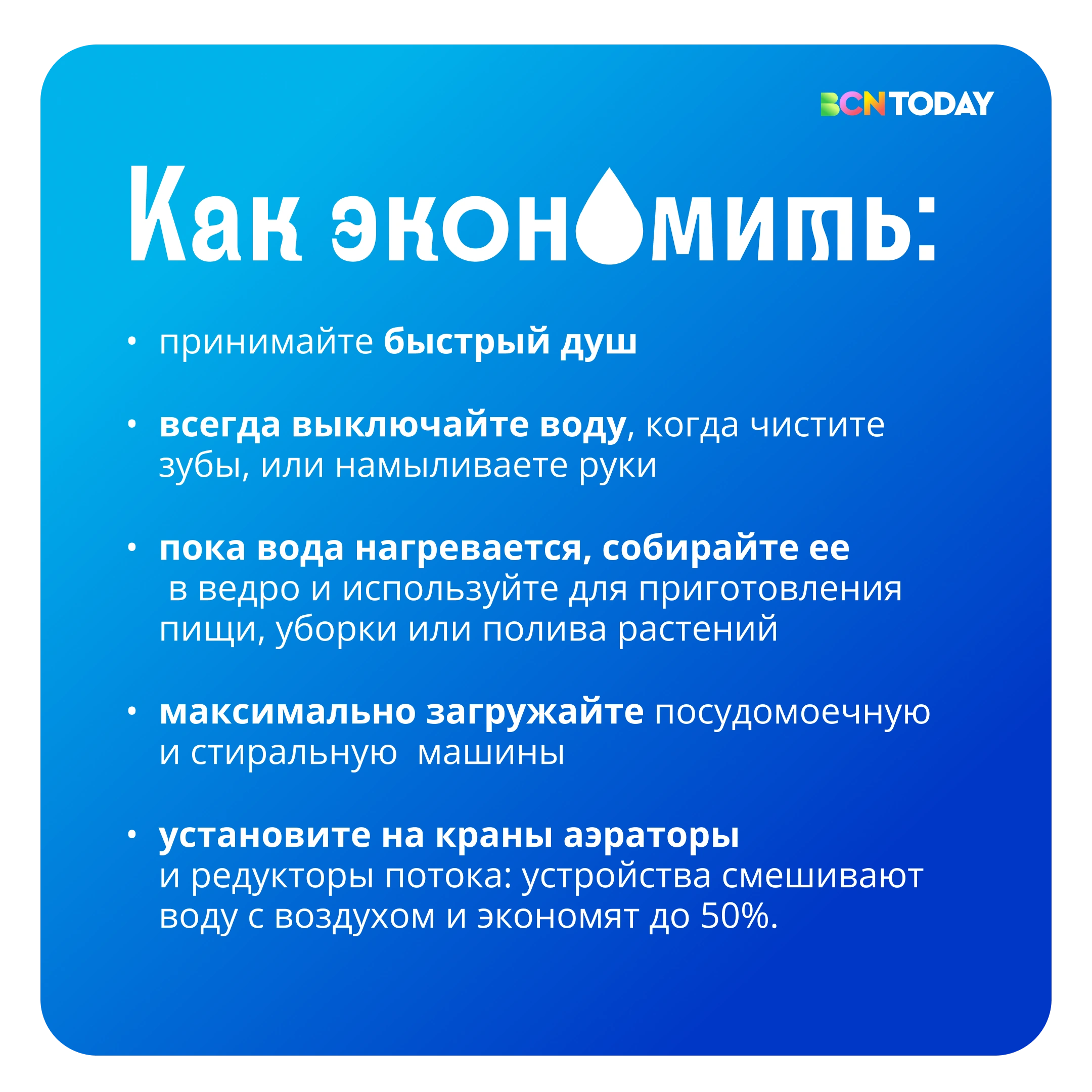
Original Russian-language editorial piece with water-saving advice.
04 / Everyday advice

Original BCN Today editorial pieces. Russian copy is retained as part of the design.

05 / Illustration & infographicsShapes that explain

From character
to information.

The geometric language adapts to the topic: characters for a story, visual scales and relationships to explain a piece of information.
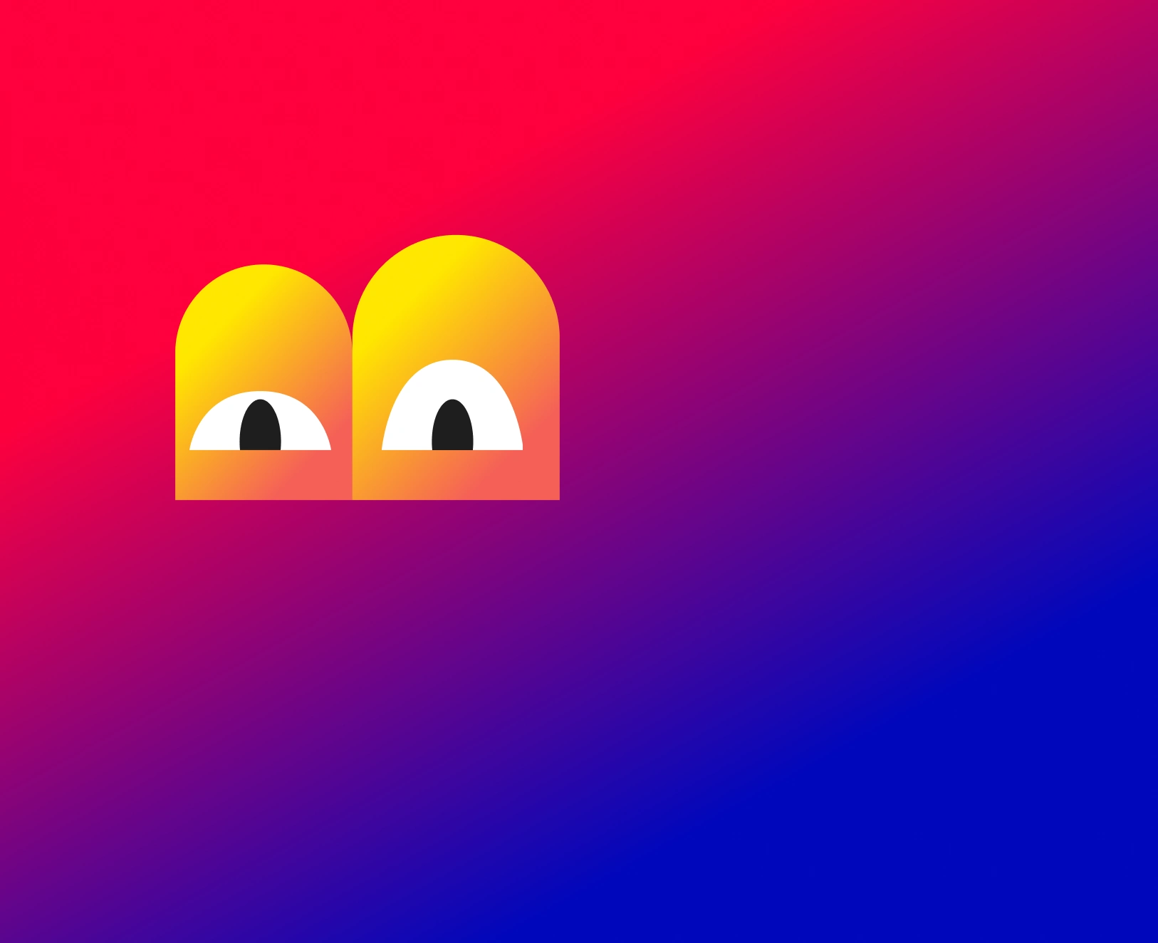
Original BCN Today editorial illustration about football, with characters and geometric shapes.
Editorial illustration: a sports topic told with the brand’s visual character.
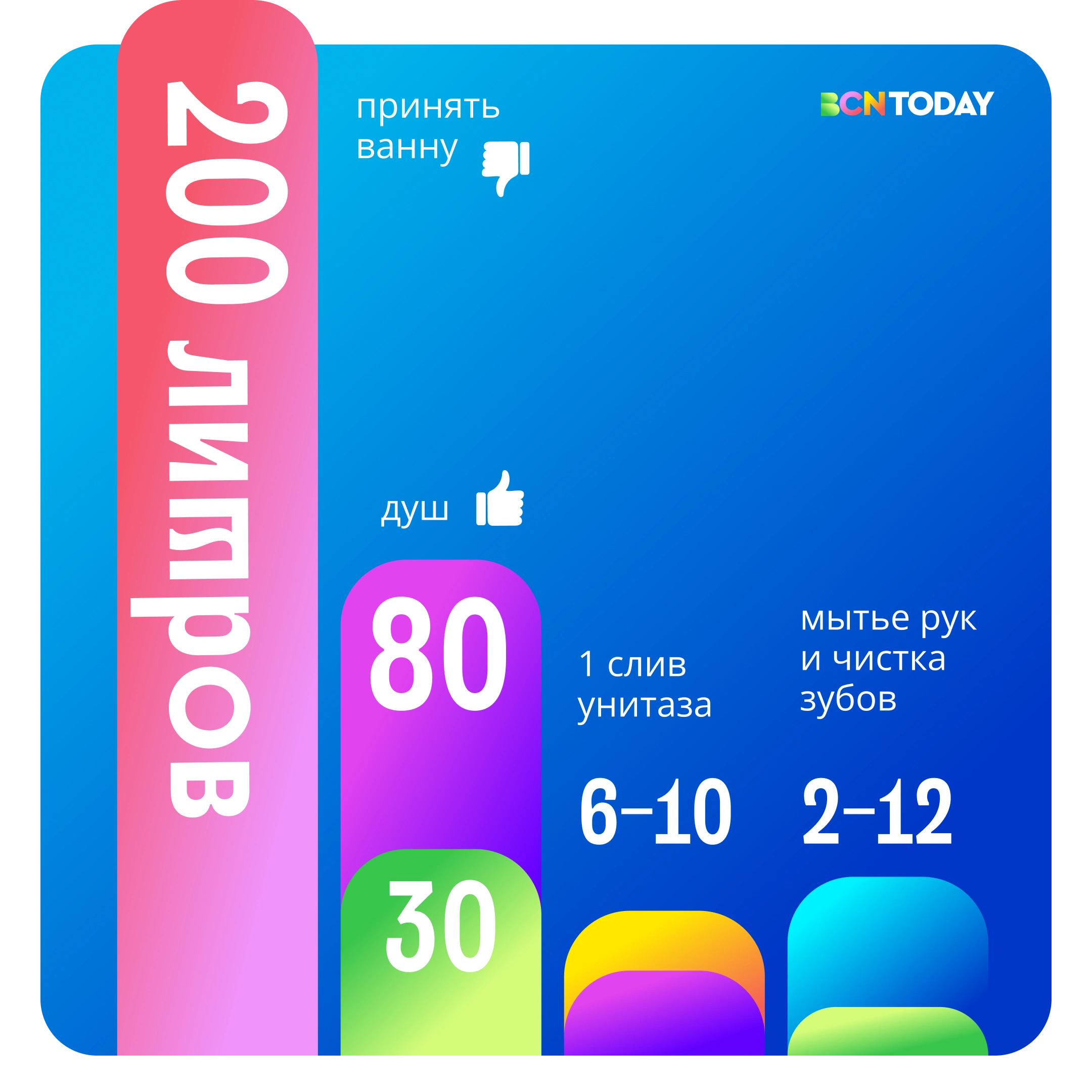
Original Russian-language BCN Today infographic organising water-related data through shapes and scales.
Infographic: colour, hierarchy and scale that support the reading.
06 / The workAn identity made to be used

One system.
Many stories.

  • 01Dynamic identity and brand mark
  • 02Colour and typographic system
  • 03Editorial templates and sequences
  • 04Illustration and infographics

A–B–Creative / Brand identity

Give your brand
a voice.

Let’s talk about your brand
Original BCN Today composition with a green B with eyes, blue Sagrada Família towers, gradients and news bubbles on pink.