Skip to content

Packaging design & brand identity

HORACLARA.

Malbec,
in a different light.

Cielo Cortado · ArgentinaBrand concept · 2026
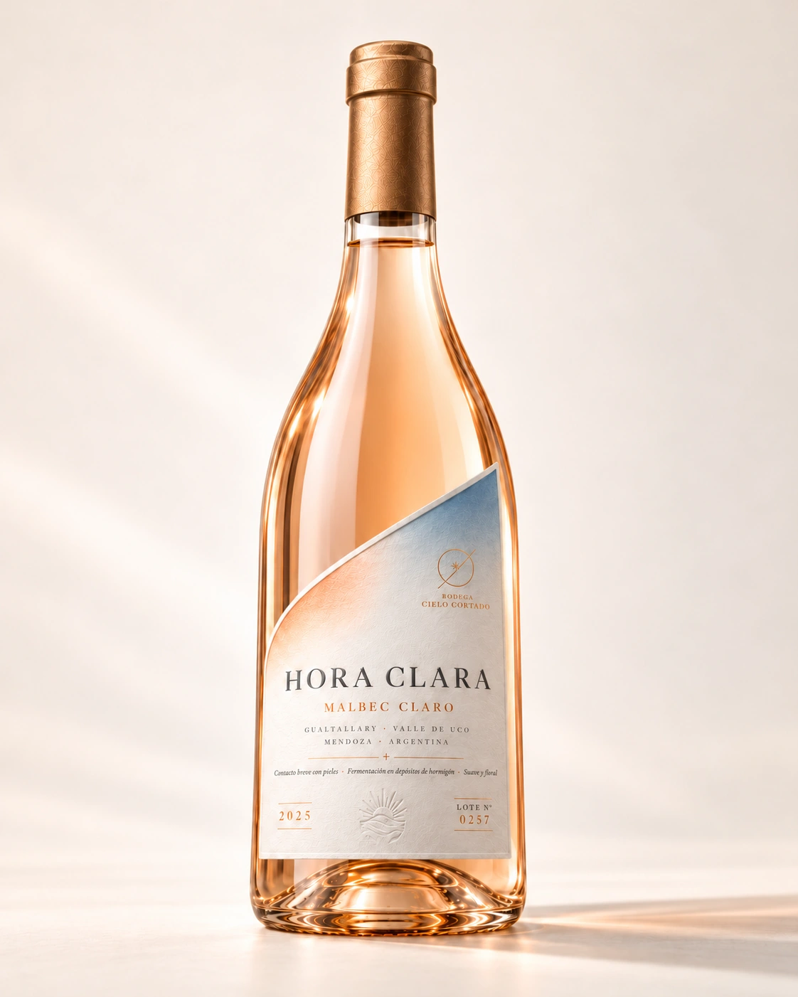
The complete Hora Clara bottle: transparent glass, pale Malbec and a diagonally cut label.
HORA CLARA / MALBEC CLAROOne grape. Another way of seeing it. ↓
01 / The briefPale Malbec · Mendoza

Reveal the
unexpected.

Reveal the character of a pale Malbec and create distinctive packaging connected to its origin.

02 / The idea

The wine is
part of the design.

The colour of the wine is part of the design. The diagonal label cut reveals the Malbec and turns the boundary between paper and glass into Hora Clara’s distinctive gesture.

A cut that echoes the separation of grape skins and must.

Detail of the diagonal label revealing the pale colour of the Malbec.
The boundary between paper and glass
03 / The origin of the gestureA design interpretation of geography

From the land
to the cut.

Argentina. Mendoza. A regional reference to 33° south latitude, translated into the angle of the label.

Geography becomes a visual language: a design interpretation, rather than the winery’s exact coordinate.

Argentina → Mendoza → 33° S → label edge → bottle.

  1. 01ArgentinaThe starting point.
  2. 02MendozaThe home of Malbec.
  3. 0333° SA regional reference.
  4. 0433°The angle of the cut.
04 / The labelFrom graphic to material

One edge.
An identity.

The name, winery mark and copper details support the cut, leaving the colour of the wine in focus.

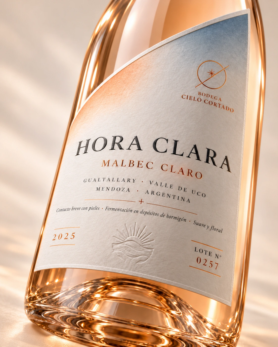
Hora Clara label macro: diagonal edge, name, Cielo Cortado mark, copper elements and simulated embossing.
The label, up close.Digital visualisation. Texture, shine and embossing do not document physical production.
Detail of the diagonal edge, HORA CLARA name and Cielo Cortado mark in the printed graphics.
01

Cut, name and mark

The cut reveals the wine. HORA CLARA and the Cielo Cortado mark organise the printed graphics.
Detail of the simulated embossed sun and copper elements: proposed finishes.
02

Copper and embossing

Proposed copper foil, a blind-embossed sun and matte/gloss contrast on textured paper.

Detail of warm reflections and light refraction in the glass base of the bottle.
03

The light

The warm reflections in the glass come from the lighting, rather than the label’s printed graphics.
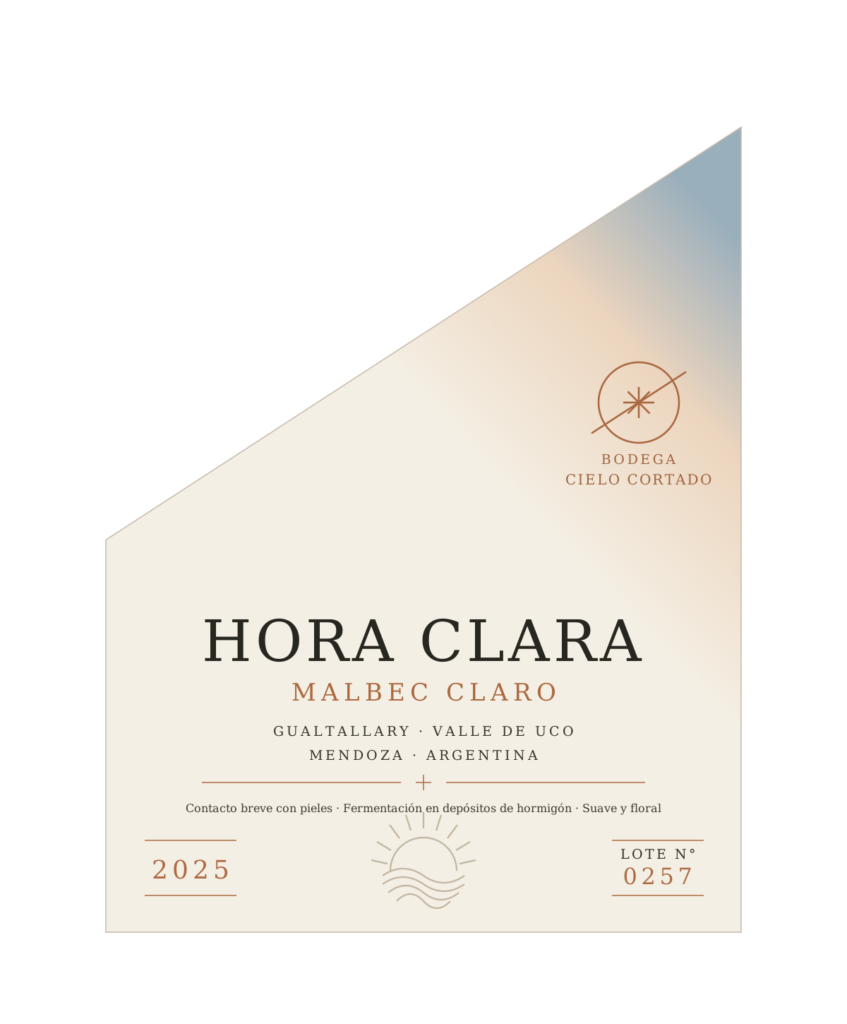
Reconstructed flat view of the Hora Clara label, with a 33° cut, brand name, winery mark and revised wording.

The graphics,
without perspective.

Flat artwork reconstructed from the design. The composition can be read without distortion from the glass or lighting.

  • 01Diagonal cut and name hierarchy
  • 02Winery mark and copper graphic elements
  • 03Proposed textured paper and embossing

Copper in the artwork represents the graphic colour; a metallic finish is proposed for production.

View the label in detail ↗
05 / At the tableFrom bottle to glass

The gesture
is poured.

33° / HORA CLARA

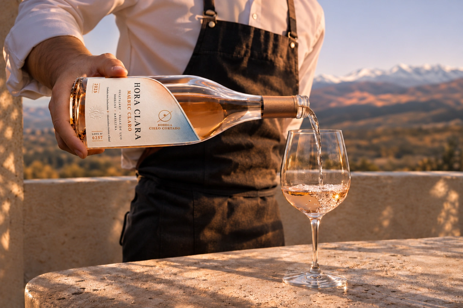
A waiter pours Hora Clara from an open, tilted bottle; the stream enters an upright glass at sunset.
The gesture of the label continues in the moment of pouring.A composition built around the diagonal.
06 / Beyond the bottleThree applications of the identity

The same idea.
New encounters.

The diagonal, typography and copper carry the identity into moments of presentation and tasting.
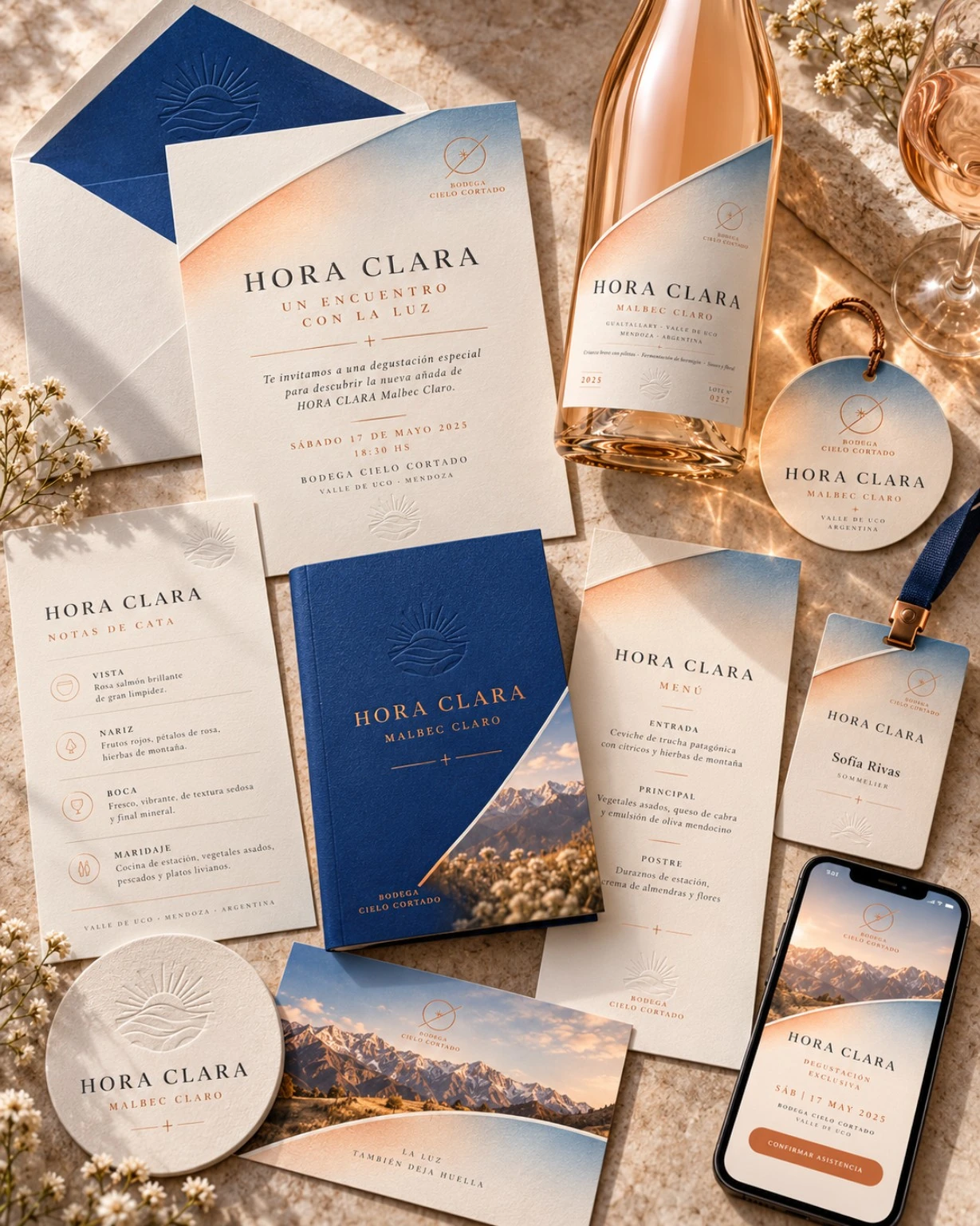
Hora Clara stationery: invitation, menu, badge and mobile version using the label’s visual identity.
01 / First contact

The invitation.

The cut organises the composition. Typography and the contrast between pale paper and blue extend the identity of the bottle.

Invitation, menu and badge as one visual family.
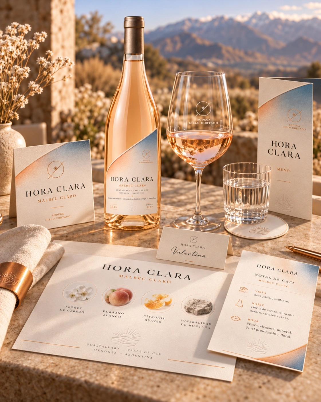
Hora Clara tasting materials: sensory notes card and table collateral beside the bottle.
02 / During the experience

The tasting card.

A simple hierarchy leaves room for the wine’s tasting notes. Colour and copper details connect the table to the label.

Service materials to accompany the tasting.
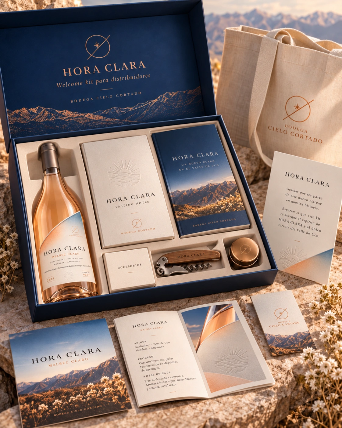
An open Hora Clara presentation kit with its bottle, compartments, printed materials and accessories.
03 / From winery to distributor

The presentation kit.

Opening the lid reveals the bottle and presentation materials in separate compartments. Tasting notes introduce the wine; the brochure introduces the brand.

Bottle, printed materials and accessories brought together for samples, meetings and sales visits.

Conceptual applications: visualisations of the identity system.

A–B–Creative / Packaging & identity

One bottle.
Another perspective.

Let’s talk about your project
The complete Hora Clara bottle: transparent glass, pale Malbec and a diagonally cut label.